Monitoring & results
The Projects list
Projects shows your folders and projects at a glance: a status indicator, a progress bar while a project runs, and small icon badges showing whether Vectorization and/or Smart Match were used — so you can tell how a project was configured without opening it:
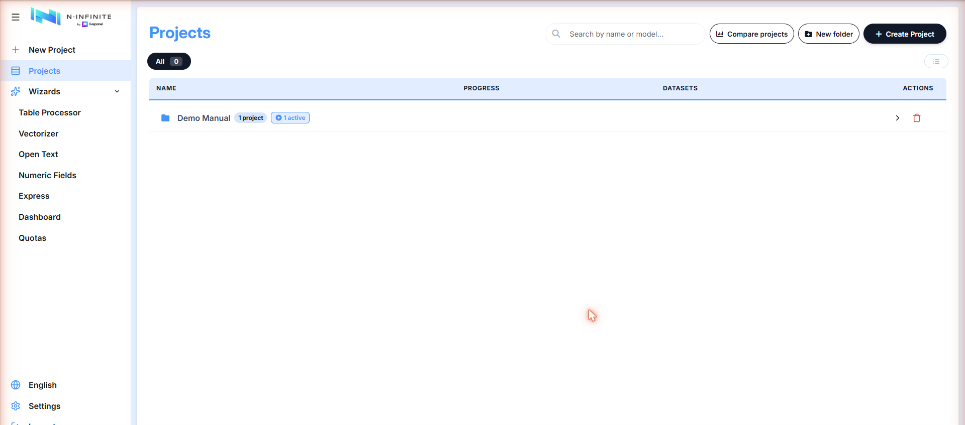
Open a folder to see its projects. Status chips at the top filter by state (Created, Training and predicting, Finished):
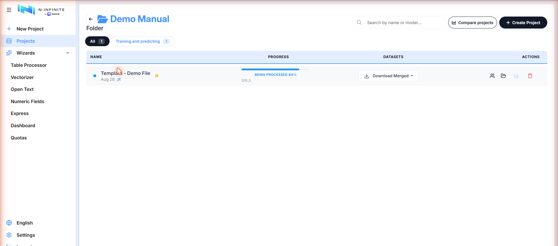
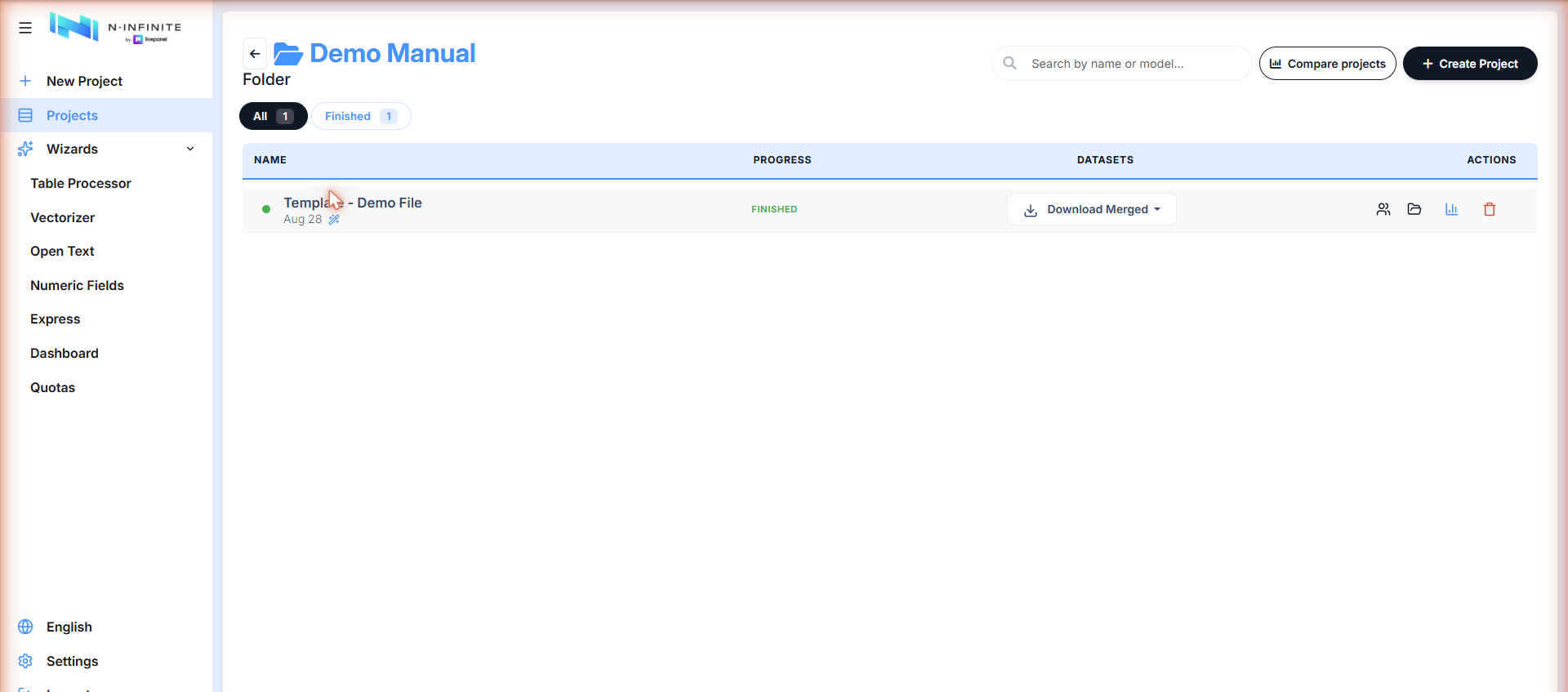
A project moves through: Created → Ready to be processed → Being processed X% (the variable currently being trained is shown under the bar) → Finished.
The project detail screen
Click a project name to open it. This is the control room for the models:
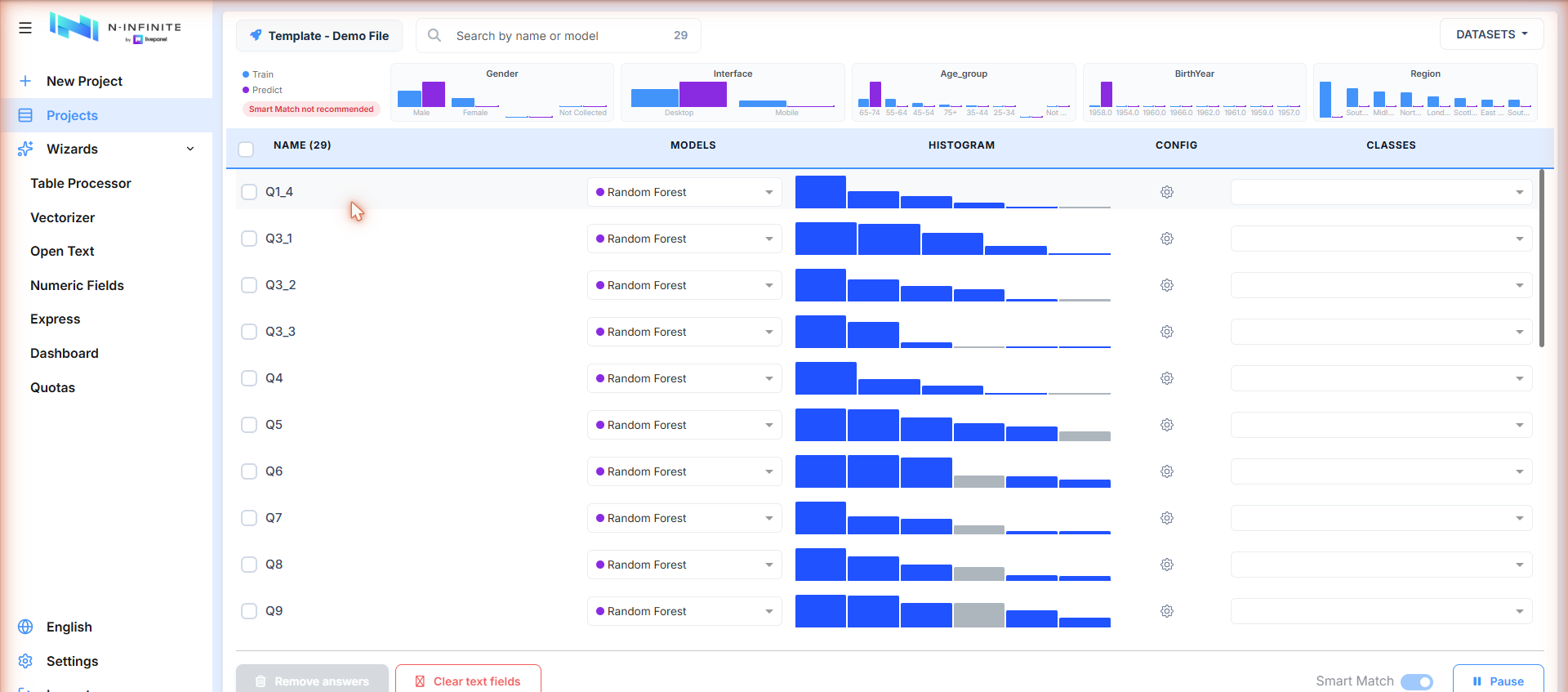
- Top strip — real (Train) vs. synthetic (Predict) distribution for key demographics, plus the Smart Match recommendation badge.
- One row per question — with its model, histogram (train vs. predicted), per-question config (Tune model) and classes.
- Bottom bar — Remove answers, Clear text fields, the Smart Match toggle and Pause.
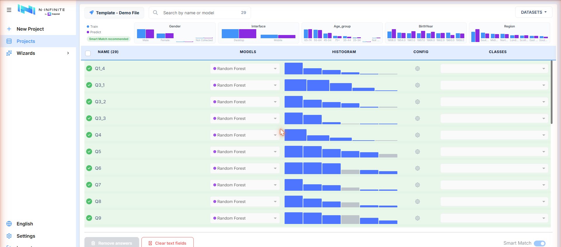
Green check marks appear per question as processing completes:
Choosing a model per question
Every question defaults to Random Forest, and you can switch it:
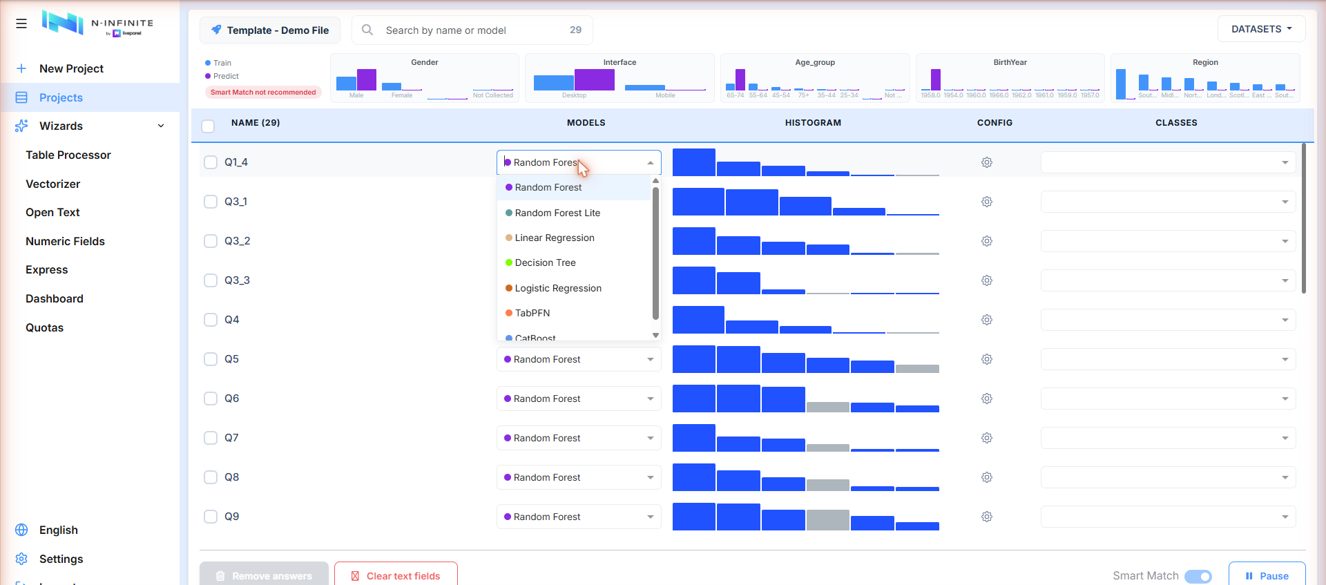
Available models: Random Forest, Random Forest Lite, Linear Regression, Decision Tree, Logistic Regression, TabPFN, CatBoost.
The DATASETS menu
The DATASETS button (top right) opens the project's datasets — options enable as they become available:
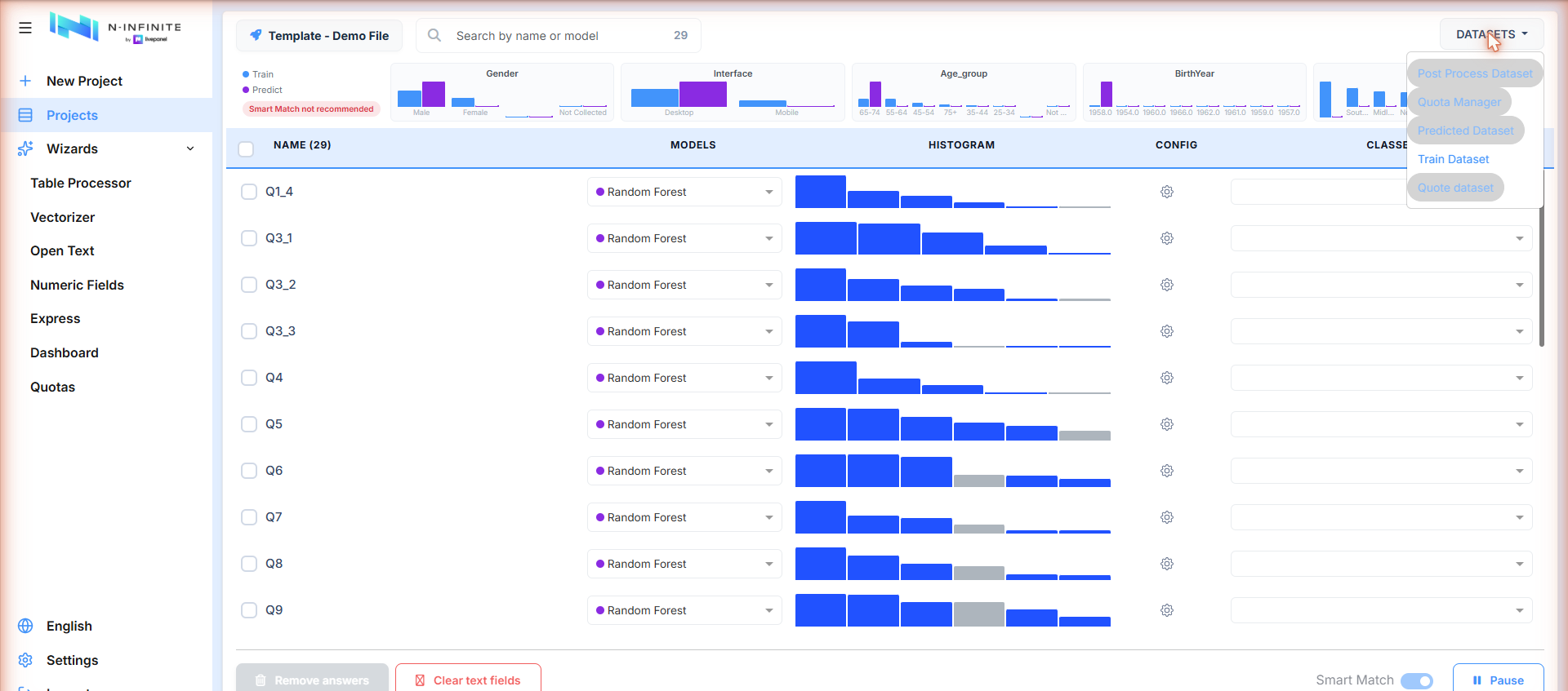
Train Dataset is available from the start; Predicted Dataset, Post Process Dataset, Quota Manager and Quote dataset activate once processing produces them.
Quality: the charts dashboard
Every project includes a comparison dashboard showing, question by question, how the synthetic (predicted) answers compare to the real (train) answers. It is available early — even before a project finishes training — and also feeds the Smart Match recommendation (see The prediction engine). Open it with the bar-chart icon in the project row:
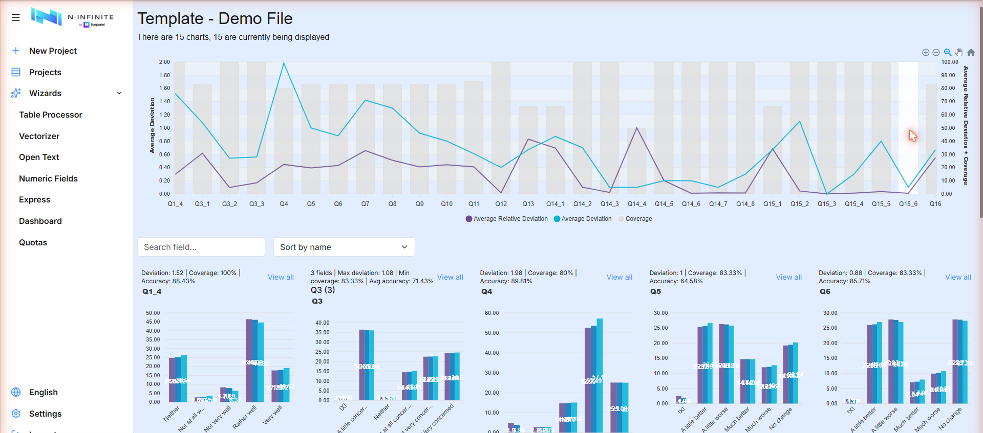
- The overview chart plots Average Deviation, Average Relative Deviation and Coverage for every question.
- Below it, each question shows Deviation, Coverage and Accuracy plus a bar chart comparing distributions — click View all to expand:
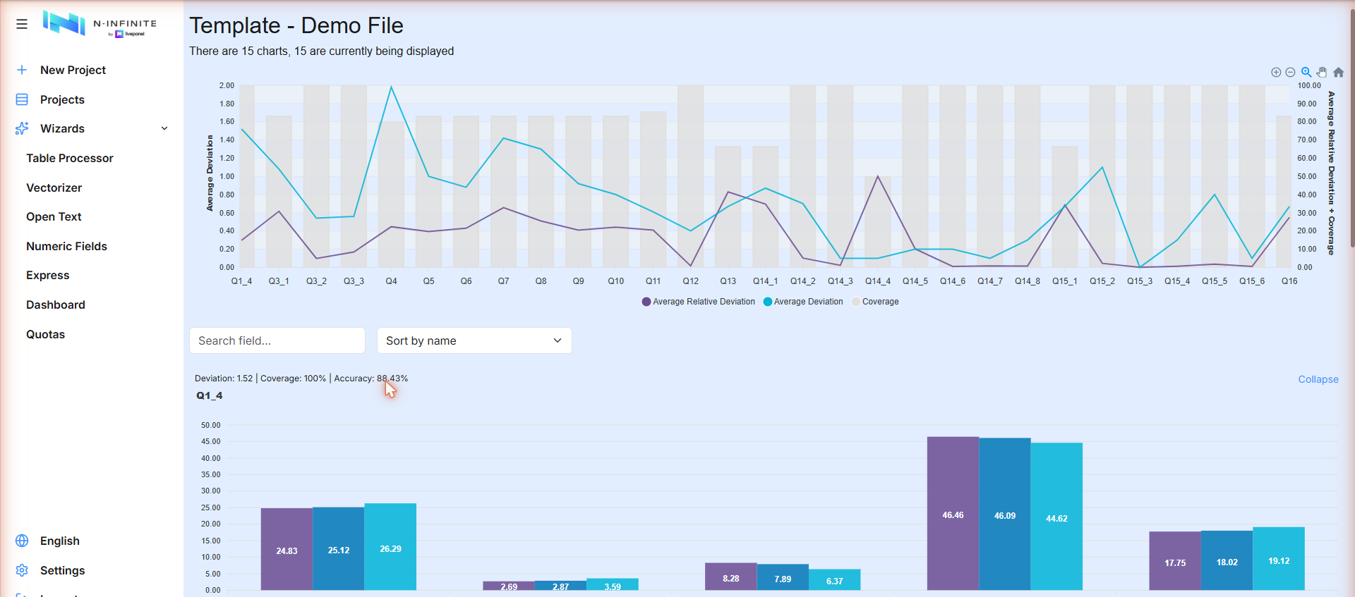
The three bars per answer option are the training data, the predicted data and the merged result — they should look nearly identical.
Downloading results
Download Merged in the project row offers every output:
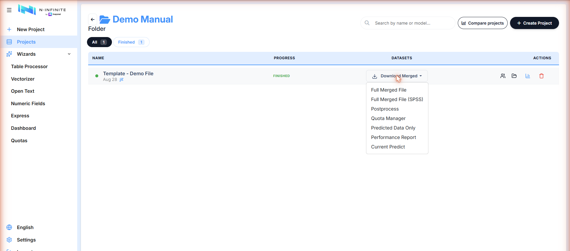
| Option | Content |
|---|---|
| Full Merged File | Real + synthetic respondents in one Excel file |
| Full Merged File (SPSS) | The same, as an SPSS .sav |
| Postprocess | The post-processed dataset |
| Quota Manager | The quota-adjusted dataset |
| Predicted Data Only | Only the synthetic respondents |
| Performance Report | Excel summary of every question: which model was used, its accuracy and processing time, plus overall project averages |
| Current Predict | The current prediction snapshot |
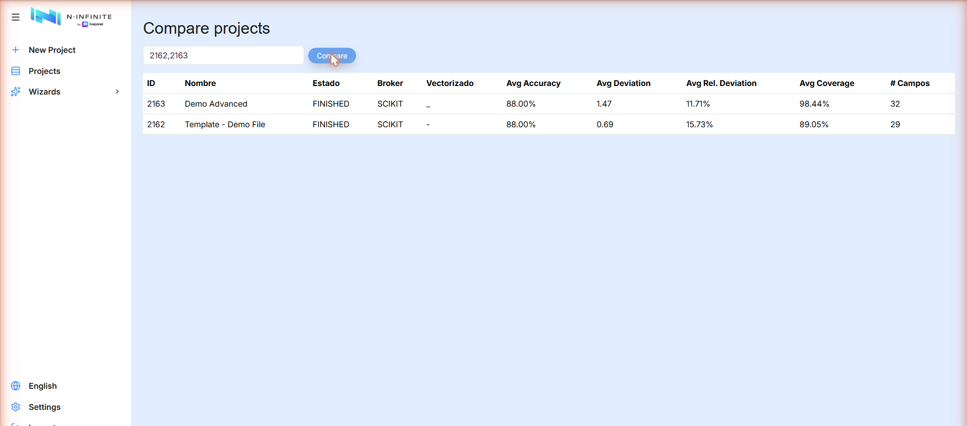
Comparing projects
Compare projects (top of the Projects list) takes comma-separated project IDs and shows their key metrics side by side — status, average accuracy, deviation, coverage and number of fields: